
Carbon Design System
Creating a bedrock for 100s for designers across the globe to accelerate development and reduce time wasted
Positions and Timeline
Role
UX Designer
Team
World Wide Design Team for IBM Carbon Design System - White version for web
Duration
4 Months
Product Background
"Card" components for the IBM Carbon White Design System had to have consistency and flexibility to account for a wide variety of content while still maintaining a consistent look and feel.
Challenge
There needed to be a bedrock of the base component that was well constructed enough to accommodate the flexibility of variants without requiring editing of this underlaying base.
Approach
Iteration and testing throughout the process making sure components matched up with storybook examples and making sure to integrate feedback from designers who were going to be using the components.
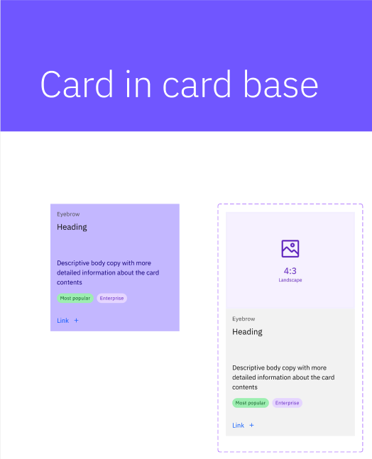
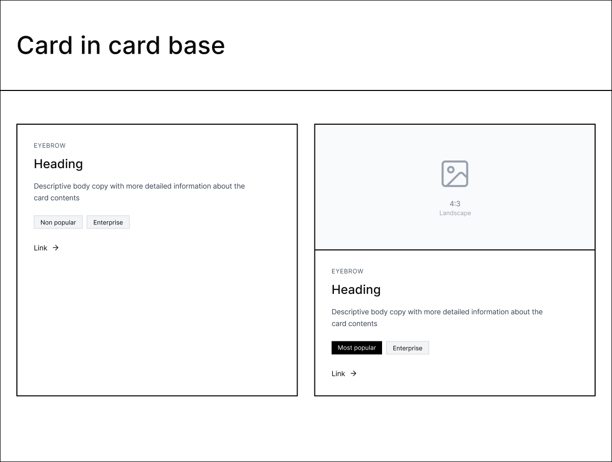
Building From Bedrock
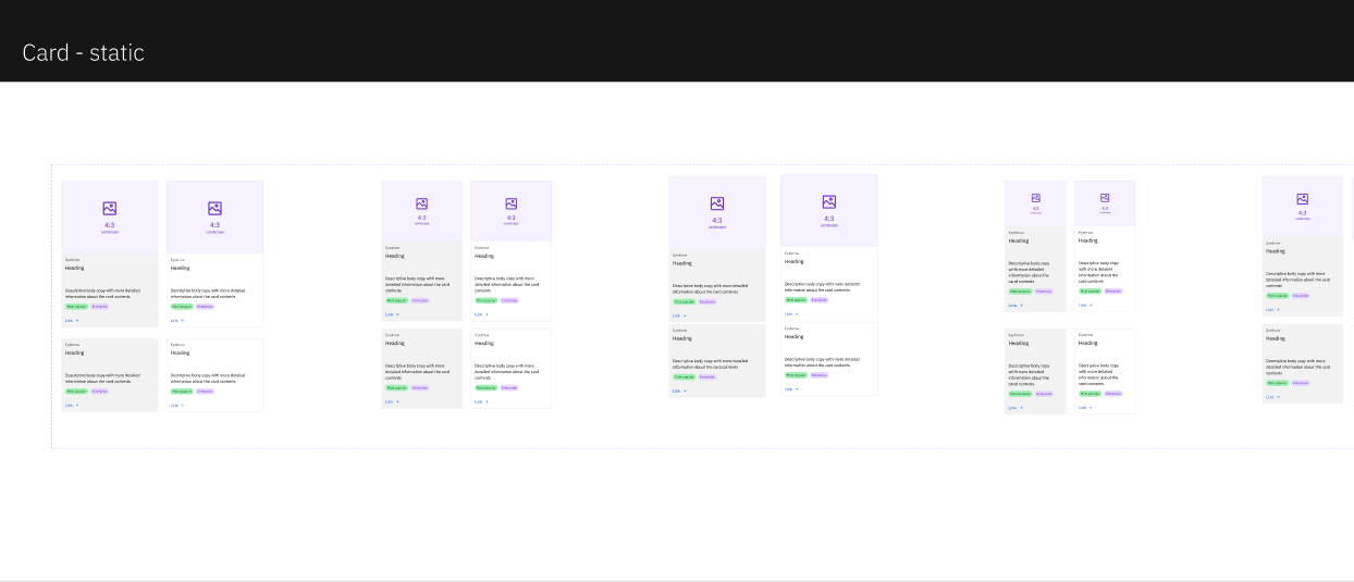
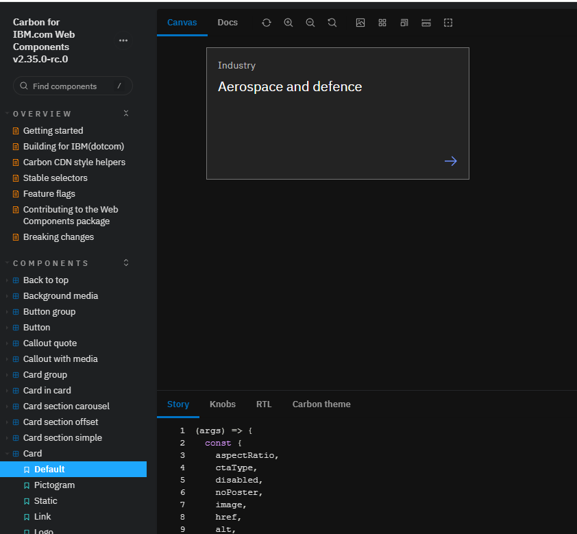
Cards are a core component of the IBM Carbon Design system because they are used in nearly every context a designer will encounter. The static versions of the cards needed to be built first in order to have a solid foundation for most complex cards.
Building For Complexity
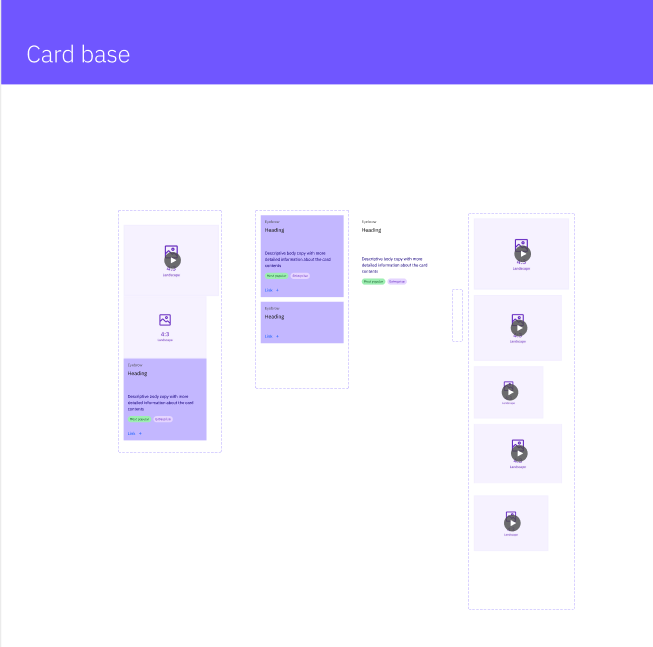
The second pass accounted for different sized and typed content (including video), making sure the base component was constructed robustly enough to accommodate these variables.
Results
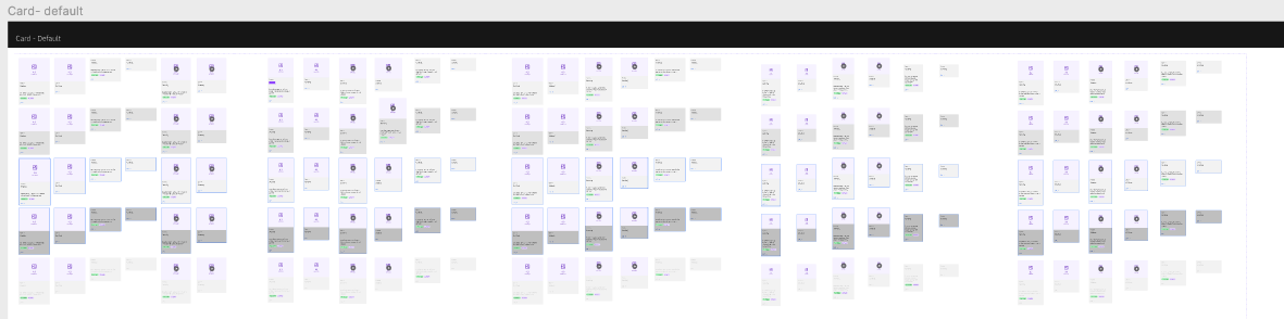
I ended up with 150 card variants that went live for IBM Designers across the globe. These included variants on content, colors, and breakpoints to account for different screen sizes.
Notes on Possible Future Improvements
Were I to revisit these cards, I would likely make better use of booleans to make the customization even easier for the users of these components. Additionly I would make sure each component was clearly usable by AI programs like Figma Make.